

Monday 25 February 2013
Sunday 24 February 2013

Monday 11 February 2013
Winter Soldier - Review.
Winter Soldier - issue 15.
Writer - Jason Latour.
Art and Colour - Nic Klein.
Cover - Declan Shalvey and Jordie Bellaire.
Editor - Lauren Sankovitch.
Marvel Comics
.JPG)
I have to admit that I picked this up because of the buzz over the Declan Shalvey and Jordie Bellaire's cover. And a superb cover it is! Worthy of a poster (if Marvel still did them?) But the interiors are just as impressive and a great read. The book would fit happily on the shelf between Ennis' FURY Max title and Rucka's Punisher series.
The book opens with some space shennanigans that would seem to foreshadow future issues. Almost at right angles to these scenes we quickly switch to Bucky Barnes aka The Winter Soldier in a bar in Croatia drinking in the rubble of a bar fight. He is 'trying to forget' (in that grand old Laurel and Hardy way) when Fury enters. Fury (Ghost of Christmas Bucky Future?) drinks with him and gives him a mission to take his mind off The Black Widow drama (that happened in previous issues).

The rest of the story centers around an undercover SHIELD agent who has infiltrated Hydra and been undercover with the crime organisation for years. He has seemingly gone a bit 'radio rental' and is in a fire fight out with an off shoot of Hydra called The Dark Hydra. A subgroup that appear to have developed 'The Thing' (John Carpenter, not Ben Grimm) style shape changing abilities. Bucky punches out the agent (who then vomits) and the story will continue into issue two with them both.
This book reads like a Marvel Max title. It is a satisfying mix of Marvel Superheroics, 100 Bullets style machinations and a dose of body humour (Think Brian Yuzna's 'Society' and you won't be far off). It has an edge to it. The dialogue never intrudes and always injects an added dimension. It bristles with cool and it has a sense of humour that only adds to the bleakness.
Visually Nic Klein blew my socks off. He pencils, inks and colours the book with a real noir flair. I have recommended this book to a couple of friends and described it as 'Superspy noir'. It is a real joy to read and the pacing is superb. There is a Bond/Parker/Flint flow to the panels that makes me wish it was set in the 1960s (Man from UNCLE cameo he chants).
'I don't know what I was expecting in Croatia.'
Bucky, just clear of a brutal bar fight is melancholy and distant. He is written as a tragic ghost. He is living his days out in a back alley battlefield. having been kept on ice for decades and used as a programmed assassin. He is quick to violence and is brutal in it's application ,yet practical and systematic. He is a mess of guilt and self punishment. Like a man lost he can only push on through with an operation to distract him. A fact that Fury knows and uses too well.
Joe Robards is more of a Bond figure (at least physically). He has been broken by years of being undercover and the murder of his handler/lover. (By the Winter Soldier himself). He is seemingly at the end. Sitting behind an overturned bar table surrounded. Bucky appears and save him in an absolutely excellent double page spread. Vibrant and kinetic. The page's design speaks to the abilities and enhancements of Barnes. The page also makes full use of it's colour and shows what we all know about good colourists.
.JPG)
I am maybe painting it all a bit too black. It also has a sense of humour. The appearance of the shape changing Hydra agent is both gross and funny in equal measure. Jason Latour seems to have a great eye for the tone in this book. It's a dirty and dark book that I shall be picking up from now on. I am sure as eggs is eggs that nobody is what they seem and complications are gonna fuck up everyone. Superb!
Plus best ever knuckle duster!
.JPG)
Buy it!!
NIA

Thursday 7 February 2013
Cover of the day.
I loved this cover when I was a kid.
I remember thinking 'Who's that white werewolf guy and how come werewolves are that strong to knock out the Hulk??'
I am still not sure why that lady has horns on her headband though!
Great stuff.
NIA.

I remember thinking 'Who's that white werewolf guy and how come werewolves are that strong to knock out the Hulk??'
I am still not sure why that lady has horns on her headband though!
Great stuff.
NIA.
Wednesday 6 February 2013

Tuesday 5 February 2013
Cover of the day.
Took this great issue of Man-Thing (issue 21 from 1975) to read on the commute today.
Written by the ever inspiring Steve Gerber with art by the criminally underrated Jim Mooney.
The Bronze Age at it's best.
NIA.


Written by the ever inspiring Steve Gerber with art by the criminally underrated Jim Mooney.
The Bronze Age at it's best.
NIA.
'Warp' - A play and a comic!
First Comics was part of the mid 1980s indie attack on the big two. They were genre based and had a no holds barred attitude to storytelling. Without fail they produced interesting comics by top creators. Standouts in their line included American Flagg, Nexus, Starslayer, Sable, Badger, Grimjack and Dreadstar. Many of the titles were pre existing creations or extensions of book lines.Their books always seemed to have both an edge and an angle that set them apart from the crowd. They represented experimentation that we like to see these days in the Image Comics line of books.
Founded in 1983 First Comics found a home in Chicago. They had a little bit of a turbulent history and often featured in the news pages of The Comics Journal. At one point they took Marvel Comics to court claiming that they were unfairly influencing their shared printers and in doing so attempting to elbow them out of the market.
Whether it be comedic superheroes, galactic pirates, interdimensional hitmen or schizophrenic kung-fu masters they were never afraid to push boundaries and experiment. I loved their books and still have an almost complete set to this day.
However adapting a short lived hippy dippy stage play (even these days) would seem a little strange. And that is what Warp was (well originally at least.)
Warp was a book that remained ignored by me for quite a while (along sadly with Marrs which was another great title). It was a book that had great dollops of quirky charm. It's history seemed an interesting place to take a look at for the blog.
Back in 1971 Warp was a stage play that was written by Stuart Gordon and Lenny Kleinfeld (writing under the pen name Bury St Edmunds). It was written for a Chicago based theater company and eventually it made it to Broadway for around a week in February 1973. the original production featured 'Home Alone's' John Heard.

It seemed to consist of the usual late 1960s / early 1970s hippy BS with 'Dave Carson' (a bank teller) being transported to a far flung space civilisation and becoming Lord Cumulus. (On a Planet called 'Den-La' no less). I shit you not that the villain was called 'Prince Chaos'.
The writers claimed Marvel characters Doc Strange and Thor as inspirations and when the production hit Broadway they had Neal Adams as artistic director. The play actually won awards for costume design. It was intended that the play have a 'serial' aspect to it and that it would run through a number of stories. (and to think that we are now left with crap like 'Rent' and Les Miserables' - I would have def paid to see Warp).
From the research I have done so far the fact that it came to First is still a bit of a mystery. I can only guess that since both were Chicago based there was some form of cross over between creative types of the time.
.JPG)
Warp the comic had a longer run than it's play. Although it only ran as a regular title for nineteen issues. (The Warp Special ran for a further three issues.) First comics of the time generally had longer runs than this. But throughout it's run it utilised some great talent. The creative mainstays of the main story (that mostly featured Lord Cumulus) were Peter B Gillis, Frank Brunner and Bob Smith. It has a John Carter/ERB feel to it (a man transplanted and possessing great power) and a mystical fantasy element (similar to a Moorcock's Elric and Brass novels). Although let's be completely honest here - it was tongue in cheek thoughout!
.JPG)
Gillis had been a mainstay at Marvel and would return there both during and after. He had both edited and written there. Writing the actually pretty darn good post Jack Kirby Eternals 12 issue mini series and working on the ground breaking Strikeforce Morituri.
Frank Brunner brought the Robert E.Howard panache to the title and in a book that had been mostly designed prior to the Star Wars revolution it had a great look. (albeit some rather strange cod piece action).
.JPG)
They also had some great talent on the back up stories. Jack C Harris and Steve Ditko's 'The Faceless Ones' being a highlight. Other creators who turned up during the run include Howard Chaykin, Joe Staton, John Ostrander and Bill Willingham.

It may be that the book suffered from the 'too many chefs' problem. It remains a strange fish even in the First Comics stable. It's well worth a look though. So have a look in the dollar bins.
NIA.

Monday 4 February 2013
Comics Club on Tour - Marts (part 1).
In the very talented company of Dave Stokes, Marc Laming,
Matthew Harrower, Martin Shipp and Dave Houghton I attended the Royal National Hotel's Comics Mart in Central London this weekend.
I have been attending Marts on and off since the 1980s and
have always enjoyed the Royal National and was interested to see if it still
had the same attraction in these days of dwindling sales and fan apathy.
It was actually a pretty good day (buoyed by the company I am
sure) and I managed to pick up quite a few things I had gone with the intention
of buying (always a good sign). I also bagged a signed Iron Man issue 1 for the Boy Wonder by Kieron Gillen who had a signings table in one of the halls.
The hall was not as packed as in recent years and I still
recognised some of the same old faces.
I managed to plug a sizeable amount of my gaps in First
Comics Warp, Starslayer and E-Man. And all for 50 pence each!
.JPG)
.JPG)
.JPG)
For me First Comics
were a landmark company during the boom 1980s and I read nearly all of their titles and find them very
enjoyable still to this day. They attacked genre without mercy and are worthy of a much more extensive review than this (I promise). Badger and
Nexus (and especially their crossover issues) were always leaders of the pack
for me. Both characters never really fully exploited since. You can’t help but
notice how much Deadpool owes in tone and character to Badger.
Just take a look at this incredible cover by Steve Rude.
.JPG)
I grabbed a couple of
issues of Starblazer digest comics for the sake of nostalgia. This series along
with the War books DC Thomson put out have a quintessentially British feel to
them and often (as was common at the time) fail to credit writers and
artists. If you can figure out which
issues to order you can find stories written by Grant Morrison or drawn by the
likes of Cam Kennedy, Mike McHahon, John Ridgway and John Smith.

These digest books seemingly ran on and on and there were
almost 300 issues running between 1979 and 1981.
.JPG)
The stories reek of old school pulp sci-fi and often have a
Trevor Hoyle or John Wyndham 'pre Star Wars' feel to them. I genuinely wish I had
paid more interest to them as a kid. They are closer in style to the European
books of the time than the American comics. Often slightly over dramatic but
certainly weirdly British (think Blake's 7 rather than Buck Rogers and you will
be half way there).
Great reads nonetheless.
A great day but what the fuck is up with non stop DVD salesmen!??
More Mart to come tomorrow.
NIA.
PS If you are on Twitter you can find me @Ezohyez
My Esteemed Comics Clubs pals can be found at the following.
Dave Stokes (@davestokes), Marc Laming @monkey_marc), Matthew Harrower (@hp_matt), Martin Shipp (@ShipptEsq)
Err Dave H doesn't approve of Twitter :)
Cover of the day - Star Trek.
Cover of the day comes from the superb Gold Key reprinting, BBCtv authorised, weirdly coloured 'Star Trek Annual' from 1972.
For those outside of the UK (and not in the know) these annuals were released on the run up to Christmas and usually featured reprint material with some added text pieces and puzzles.
Mostly aimed at keeping the kids quiet over the holidays in the pre digital age.
They were actually pretty cool and nearly all hardbacks that many I have kept to this day.
This particular annual however was a 'Comics Club on Tour' purchase at the ever reliable Notting Hill Book Exchange for the princely sum if £2.
Can't be bad.
Enjoy.
NIA.
Sunday 3 February 2013
Cover of the day.
'Forces in Combat' issue 35 from January 1981.
From Marvel UK again.
Marvel must have been scratching their heads for a cover on this one? It looks like they just used a panel from the original book and didn't even bother to take out the thought bubble and the panel.
Let's all sing 'We miss ROM'!
Great image by Sal Buscema though.
NIA.

From Marvel UK again.
Marvel must have been scratching their heads for a cover on this one? It looks like they just used a panel from the original book and didn't even bother to take out the thought bubble and the panel.
Let's all sing 'We miss ROM'!
Great image by Sal Buscema though.
NIA.
Saturday 2 February 2013
Panel of the day.
From the incredible Joe Kubert presents issue 4.
This series blows my mind every month and I am really enjoying 'The Redeemer' strip.
Hopefully this will make it into a hardback soon!
Enjoy.
NIA.

This series blows my mind every month and I am really enjoying 'The Redeemer' strip.
Hopefully this will make it into a hardback soon!
Enjoy.
NIA.
Early Thor and Alan Davis.
As part of our ongoing series we thought that it might be worth a look at a couple of Alan Davis' early Marvel UK pieces.
Going through some boxes I found a couple of Thor pieces that seemed worth a post after Mr D's recent runs associated with the character.
Alan Davis (perhaps to most more than anyone) has long been associated with Marvel UK due to his work on the revamp of Captain Britain with Alan Moore. He was also apparently in the same pot as the likes of John Higgins and Steve Dillon (among loads of others) as a jobbing comics artist and illustrator who worked on alternative fill in covers and pinups.
A lot of this work never got seen by the US market.
Here is a double page pin up that made it's way into 'Super Spider-Man TV Comic' issue 486 from June 1982 and a personal favourite. I just love the darkness and detail. (The sword in Valkyrie's hand just looks so great).
.JPG)
Here is a cover that Alan did for 'Marvel Action' issue 1 (I think from 1983). This was the first issue in a little revamp of the titles where they were given new paper covers (rather than the shiny stock paper used for a while on titles like 'Planet of the Apes', 'Dracula Lives', 'The Mighty World of Marvel' and 'The Avengers'. They were pleasingly a lot better than the crap they printed Spidey's TV Comic on.). Each issue focused on the bigger characters and went back to reprinting more classic stories from the late 1960s and 1970s.
To me this cover lacks the detail seen in his work normally. The faces (other than the Thing who seems fully realised) seem a little lacking in detail. Knowing Marvel UK at the time this may be a style they pressed on the artists, a speed requirement or merely an image that was mean't to be used in a smaller format. Who knows. But it does have an iconic and striking quality and was an image used later by the company in some advertising.
.JPG)
.JPG)

And just for a bit of fun (and because we saw him on the cover to the above issue) here is a great pinup of Dr Strange. Loved this! I actually bought this issue twice so that I could remove the poster for the bedroom wall!
.JPG)
Hope you enjoy them.
NIA.
Friday 1 February 2013
Cover of the day.
This a cover from a British black and white weekly that predates the Marvel UK stuff that I have been posting recently.
Being from July 1968 it also predates me by a few months too.
It also reprints early Marvel US material in a magazine size format.
Enjoy.
NIA.

Being from July 1968 it also predates me by a few months too.
It also reprints early Marvel US material in a magazine size format.
Enjoy.
NIA.
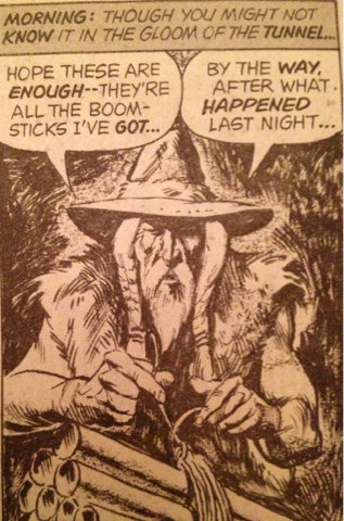
Panel of the day.
From Marvel's Planet of the Apes.
Written by Doug Moench with art by Mike Ploog and Tom Sutton.
Superb stuff!
So reprint it soon for fucks sake!!!
Enjoy.
NIA.
Written by Doug Moench with art by Mike Ploog and Tom Sutton.
Superb stuff!
So reprint it soon for fucks sake!!!
Enjoy.
NIA.
Subscribe to:
Posts (Atom)